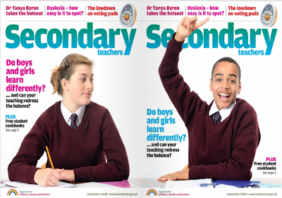
The picture above is of the front cover of a magazine, specifically aimed at secondary school teachers. The picture isn't just the front cover though, its the back cover as well. Its been cleverly done so that when its opened fully, you can see the full picture, of two school children, sat at a table.
The picture shows a young school boy who has his hand up, and looks like he wouldn't be working as well as what the young girl next to him is. This is shown by the fact that she has pen to paper but looks slightly distracted by the boys actions. The two people, the young boy and young girl are also shown to be in school uniform, which consists of a maroon jumper, white shirt and a tie. This is quite an obvious theme to have for this magazine, seen as it is aimed at teachers, and it is about the education of the children they are teaching.
By bringing up features or assumptions even from the front cover, we can tell some of the features or points prehaps made in the stories in the magazine. By showing that the boy on the front cover isn't working as well as the girl is, it could connote the boys in schools don't work as well as girls do. Another connotation that this could give is that boys in school are usually the ones to cause the most trouble for the teachers, and girls are more obedient and quiet.
The bold writing used for the title of the magazine makes it stand out, and makes it easy for people to know what magazine it is. It suits the type of magazine well, as it looks quite cleanly presented and neatly shown, which relates to how teachers are pecieved to be like; organised and nicely presented. It also suits because many educational books, used for students as well as teachers, are presented fairly similarly, so again, it relates well to the fact that it is a book made for those involved in education.
In addition to this, some of the smaller bold writing is done in different colours to match the picture. For example, the side which has the girl on it, has pink writing, which it often related to girls, and on the side of the magazine where the boy is, there is blue writing. I think this is done deliberately to show that there is a substantial differences between the two sexes, and that they are not only to do with education, but to do with everyday things
I also want to note the fact that the front covers aren't to over-whelming, they are shown to be fairly simple, so that they aren't to off-putting and overcrowded. The two people pictured on the front covers, have been placed in the middle of each side, so that they are main focus, which shows that what ever story they relate to, is the main focus of the magazine
The front cover of any other magazine would usually be different to the back cover. But on this magazine, the two are the same, other than the picture of the young boy and young girl. I think this gives off an element of equality, which would class as one of the magazines values. This could show that even though its showing that many boys and girls have big differences, they are still equals
The company that makes this magazine also makes many other magazines. Most of which are to do with education or government. Some of them are; Parents Centre, Direct Gov, S2S and Teacher.tv. This shows that the creators of this magazine have good knowledge and experience of writing about things like these, seen as they have as many publications as these, and also that they are fairly popular.

No comments:
Post a Comment