

I firstly started off with doing the background for my contents page. I wanted there to be a theme running through the magazine, so I decided to keep the background the same as the front cover. I think doing this, links all the pages together and makes them look like they belong together in the same magazine.
In addition to this, the colour of the writing I wanted to keep the same, so the same theme runs throughout the magazine. For examaple, the colours blue and white for the background, and the colours black and white for the writing. I chose to use the colours black and white through out the magazine because I think it's bold and attractive, but subtle at the same time.
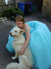
The picture is also similarly done to the one on the front cover. This, again, is to add consistancy throughout the magazine. The reason I used this particular picture was because I thought it would frame the page nicely and I also thought that the pose of the picture would be suitable for the contents. This is because his facial expression and body language adds the effect of something being interesting on the page, and makes the reader look there.
I was also going to add a editors's thanks to this contents page, thanking the customer for buying the magazine, but after testing this out, it looked a little out of place, so I decided to stick with a simple 'Thanks' in italics to create the effect of someone else writing it, e.i. the editor.
Usually, you see contents pages with the title horizontally across the top. I decided not to do this because of the picture I was using, but also because I thought it would frame the content well, along with the company of the picture along the side.
I decided to change my contents page due to one; not having 4 essential original picture, so I had to re-do it so i could make room for another one, and secondly; a typical magazine has more than just 19 pages, and people would not pay just to have this amount in a single magazine, so I re-did the contents for the magazine making it appear as though it is more full and complete.
Firstly, I started by re-arranging the content list, and adding more to it. In addition this, I made the text of the contents list smaller so it didn't seem to overcrowded and cramped. By doing this, it gave me the space to put in the picture I needed to make my original picture to four. After editing all the text, I then used 'Paint' to edit an original picture of me playing guitar. I wanted to make it seem as though it was a polaroid picture, so I decided to put thin black and white lines around the picture to give this affect. In addition to this, I found a another picture, which also looked like a polaroid picture, on the internet, on Google, of the bassist in the band 'Fall Out Boy', who I mentioned were featured in the magazine.
I kept pretty much the rest the same due to the fact I still wanted that theme of the blue background and bold lettering and text following on through the magazine. Although I later changed the front cover picture to be in colour as opposed to black and white, I still wanted this one to be in black and white to give the effect of in informing manner, such like a news paper etc.
No comments:
Post a Comment