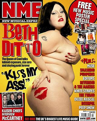
The picture above is the front cover of a well known music magazine, NME. It is a very popular magazine, as it appeals to a large audience. Although the majority of the audience is actually young teens and adults, it also appeals to the wider range of anyone interested in music.
The front cover's main attraction is the picture. Its not seen as a very attractive one, although it does attract people to the magazine, as its shocking and eye catching. The picture is off Beth Ditto. She is the singer for a band called 'Gossip', who are highly recognise to many people who read the magazine and are interested in that music scene.
The fact that the picture was obviously taken in a controlled area, i.e. a shoot, as opposed to a paparrazzi shot, makes the magazine appear a little more professional, as it has the support from the stars, to actually go ahead and get pictures of them, instead of having to steal a glance at them when they are out trying to live a normal life.
In addition to this, the background, been yellow, makes everything else on the cover appear to stick out. This is because the rest of the content of the page, is either black, red or white. This acts as a contrsting to colour, to make everything else seem more appealing. By using this colour, as well makes the magazine, as a whole, stand out, this is because many magazines are just dull and unexciting colours, but this makes a statement and shows it not afraid to stand out.
This is also shown by the actual picture itself. Its a very contraversial picture, and would, with no doubt, cause distruption amongst people who see it. This is because many people would have very different views on it. This supports the idea that this magazine isn't afraid to let go and be big and explosive. In comparrison, no other magazine would dare to do something so risky, so they just stick to safe pictures, making this one stand out more.
The fact the this is the main picture, and at the side of this picture is the name of the person in it, shows that the main focus of this issue of the magazine, will most definately be based around her, or her band. This is done to draw people into buying the magazine, as if the main story was on these, but they went with a different picture, which was advertising a 'not as popular' band or story, they wouldn't recieve the same amount of readers.
At the right hand side, at the bottom, there is a list of what else is contained within the magazine. It is put there, but its not seperated from the whole of the presentation, as its not boxed in or done in a different colour, its inkeeping with the whole of the magazines look. To make it look a little better though, they dont separate anything, they keep it all together, which has connotations with community and that the whole of the music bussiness is working together to make the best entertainment for the viewers/readers.

No comments:
Post a Comment